Colorblindness & web design – driving growth through accessible design
Why is color blindness a growth factor in web design?
Color blindness affects around 300 million people worldwide. If buttons, charts or status notifications only communicate via color, you lose reach, leads and sales. Accessible color schemes improve UX, SEO signals and conversion rates at the same time.

Imagine that a significant proportion of your potential customers perceive your carefully designed websites, landing pages and emails very differently than intended. In fact, this affects a surprisingly large proportion of the population: it is estimated that around Every 12th man and every 200th woman is affected by some form of color blindness. In European men, as many as 8% are affected by a form of red/green deficiency or color blindness.
This means that a significant portion of your target audience may have difficulty recognizing important information, navigating your website or perceiving call-to-actions if color is the only differentiator.
Inclusive design is therefore not only a question of accessibility, but also a decisive factor for the growth of your company. Here we would like to shed light on why colorblindness is relevant in web design and how websites can be made accessible for all users and therefore more successful.
What is color blindness?
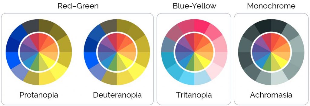
Color blindness, or more correctly a color vision disorder, describes the impaired ability to distinguish all colors well. In most cases, this is due to the absence or malfunction of certain color-sensitive cells (cones) in the retina of the eye. There are various forms of color vision deficiency and color blindness:
Anomaly – color vision deficiency
In this form, all three types of cones are present, but one of them does not function properly. This leads to attenuated color perception:
- Protanomaly: Red weakness
- Deuteranomaly: green weakness (the most common form)
- Tritanomaly: blue weakness (very rare)
Dichromasia – Partial color blindness
Here one of the three types of cones is completely missing. The forms that occur are
- Protanopia: Red blindness – those affected see significantly reduced red tones or not at all.
- Deuteranopia: Green blindness – those affected have difficulty distinguishing between green and red tones. Green often appears beige or gray.
- Tritanopia: blue blindness (rare) – those affected have difficulty distinguishing between blue and yellow tones.
Achromasia – Complete color blindness
The rarest form, in which those affected see no colors at all, only shades of gray.
The perception of colors is based on how light of different wavelengths is absorbed by these cones. In color blindness, this mechanism is disturbed. Interestingly, significantly more men (approx. 8%) than women (approx. 0.5%) are affected, as the genetic defects that lead to the most common forms are located on the X chromosome.
Why is color blindness important in web design?
Accessible web design is not a nice-to-have, but a necessity – both from an ethical and a business perspective. For your company that focuses on growth through effective digital communication, this means in concrete terms:
Improved user experience (UX):
If a potential customer has trouble navigating your website or HubSpot landing page because important information is only differentiated by color, they will be frustrated and likely leave your site. A positive user experience, on the other hand, promotes dwell time, interaction and ultimately conversions.
Compliance with accessibility guidelines:
Guidelines such as the WCAG(Web Content Accessibility Guidelines) require that content must also be accessible to people with disabilities. This means that color must not be the only means of conveying information or distinguishing elements. Adhering to these guidelines is not only a question of compliance, but also a sign of professionalism and foresight.
Inclusion as a competitive advantage:
By making your WordPress and HubSpot-based digital assets accessible to all, you demonstrate inclusivity while expanding your potential customer base. This can be a decisive competitive advantage.
Optimization for marketing success:
Imagine your email campaigns, carefully designed in HubSpot, losing impact because color-coded information cannot be correctly interpreted by some of your recipients. A color-matched design in your emails and landing pages ensures that your message reaches everyone and your marketing goals are achieved more effectively.
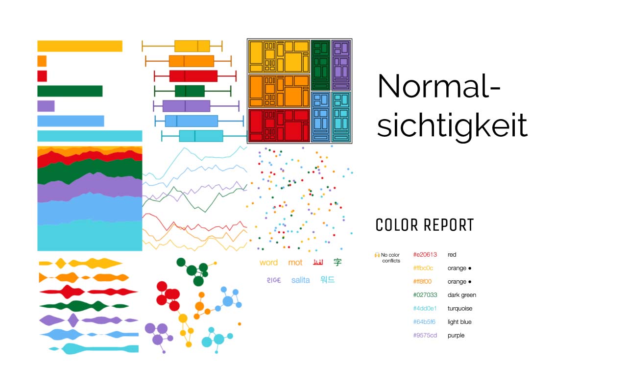
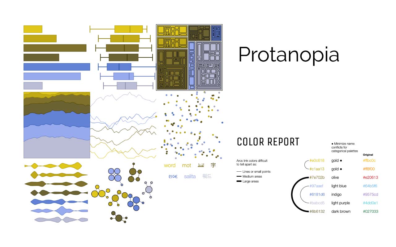
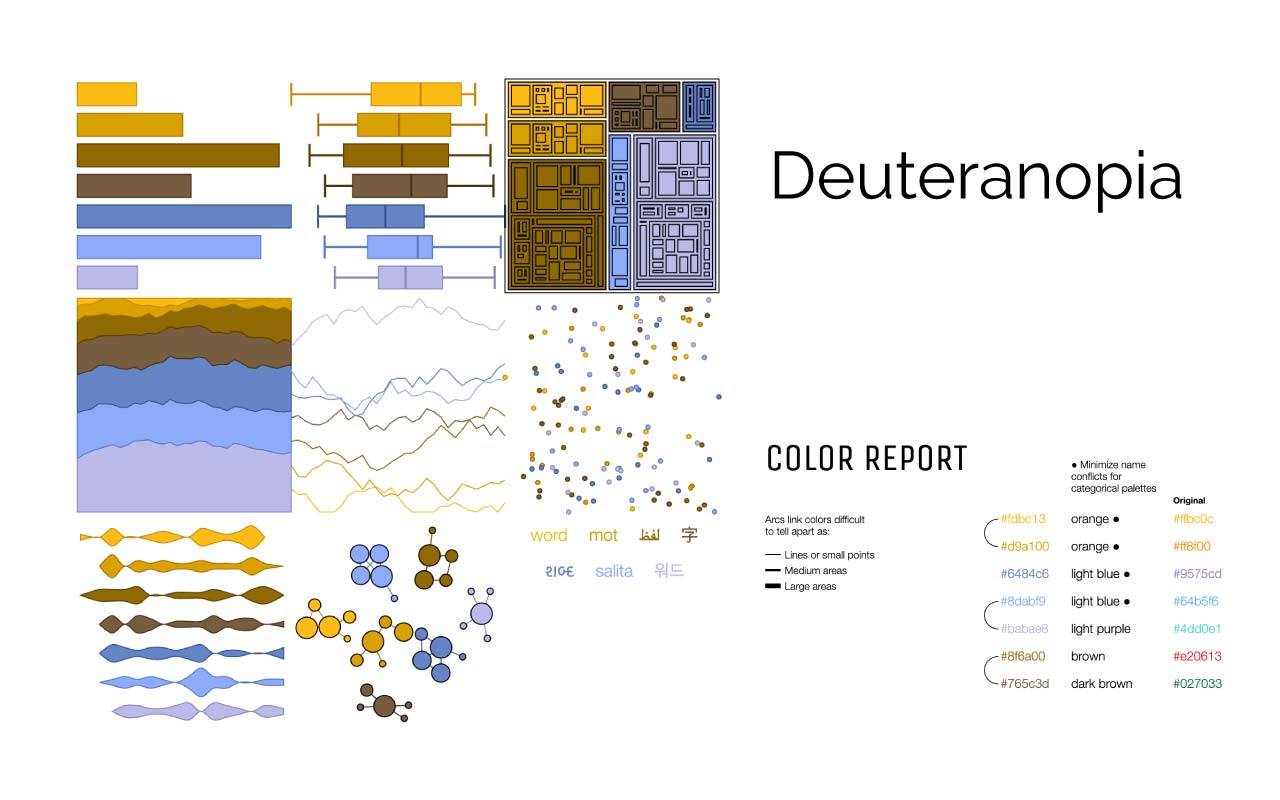
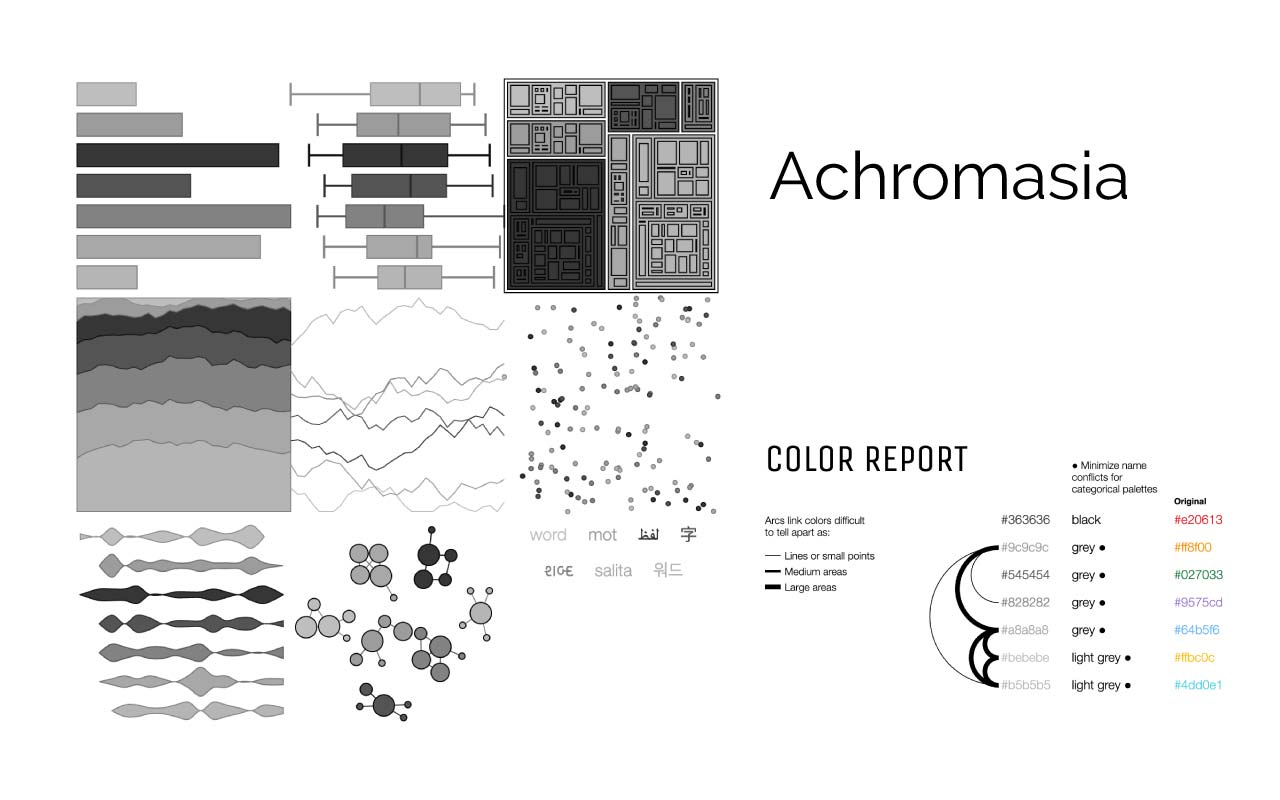
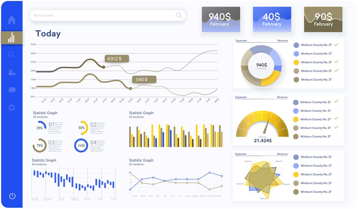
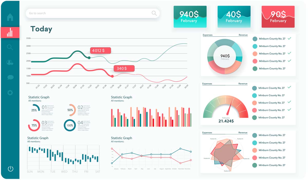
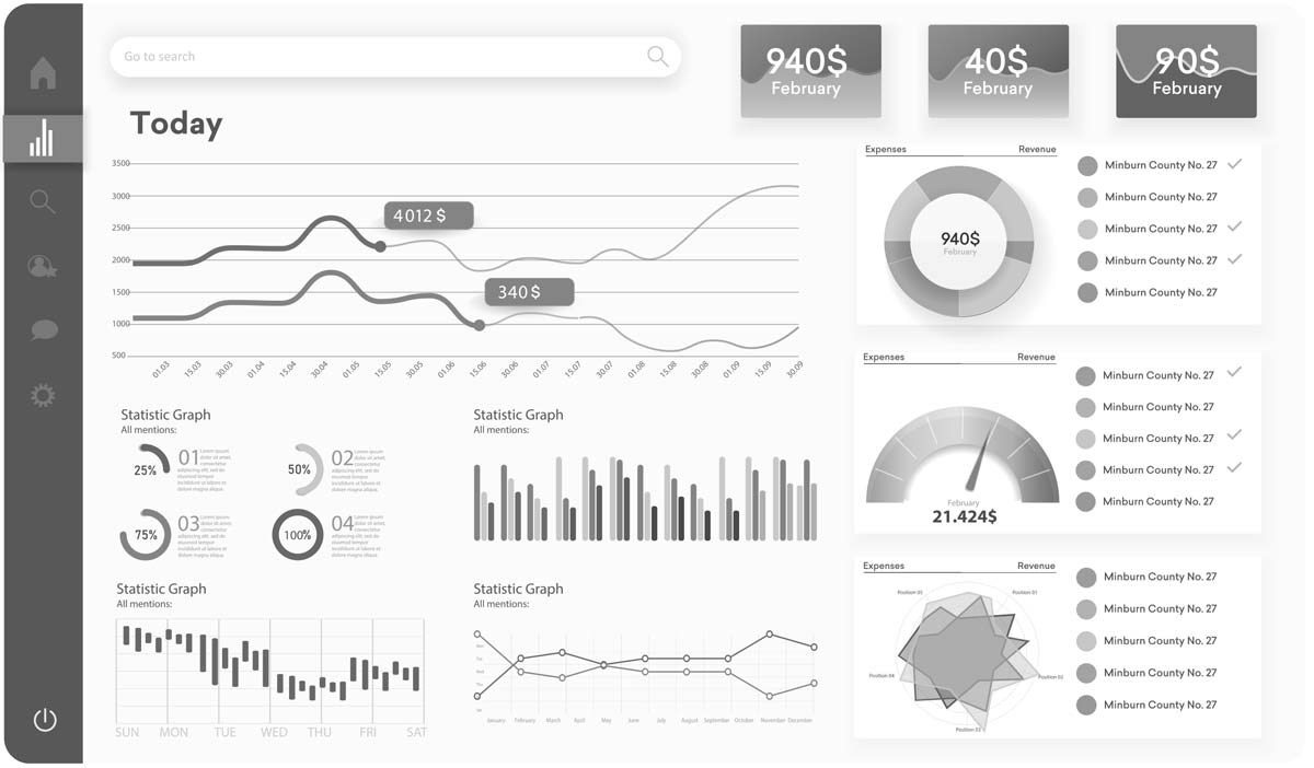
Display of a color palette in various applications, from surfaces to diagrams to fonts. The Color Report shows which color combinations are particularly difficult to distinguish. Created with Viz Palette by Elijah Meeks & Susie Lu – a freely available tool in which you can test your own color palette.
Here you will find the example with the color palette shown.
Legal requirements in Austria and Germany
Austria
In Austria, the Accessibility Act (BaFG) will regulate the accessibility of digital services from June 28, 2025. Online stores and websites must provide information in multiple channels, use easy-to-understand language and offer adaptable font sizes and contrasts. Contact information for helpdesks is also required. The law applies to manufacturers, retailers and service providers, with exceptions for small companies offering services. Non-compliance could result in fines of up to 80,000 euros.
More information on the website of the Chamber of Commerce.
Germany
In Germany, the Barrierefreiheitsstärkungsgesetz (BFSG) comes into force on June 28, 2025. It obliges companies to make their digital products and services accessible in order to enable people with disabilities to participate in economic life. This includes websites, apps and online retail. The requirements are based on EU standard EN 301 549 and WCAG 2.1 (Level AA). Violations can result in fines of up to 100,000 euros.
More information on this can be found on the website of the Accessibility Reinforcement Act.
Challenges in web design for color blindness
Even when using powerful platforms such as WordPress and HubSpot CMS, which have already implemented many of the WCAG requirements, there are specific challenges with regard to color blindness:
Standard color palettes and themes
Many default themes and color palettes in WordPress and HubSpot may not automatically provide enough color contrast or use color as the sole differentiator. Conscious customization is required here.
Visual editors
Although visual editors in WordPress and HubSpot make design easier, it can be difficult to assess actual color perception for colorblind users without the right tools.
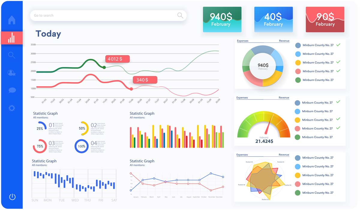
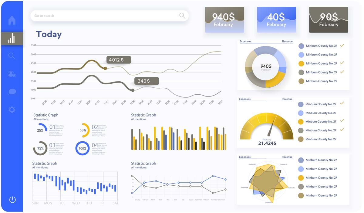
Data visualizations in HubSpot
When creating reports and dashboards in HubSpot, care should be taken to ensure that color-coded diagrams and graphics are also understandable for color-blind users.
Call-to-action buttons
If the distinction between a call-to-action button and other elements is based solely on color, this can be problematic for color-blind users.
Best practices and solutions for color-friendly web design
To ensure that digital assets in WordPress and HubSpot are accessible to everyone, the following best practices have proven their worth:
Do not use color as the only distinguishing feature:
- It is advisable to supplement color differences with clear text descriptions, icons or patterns. For example, mandatory fields in forms can not only be marked in red, but also with an asterisk (*).
- Navigation menus benefit from clear text links and optional visual cues such as underlining or frames for hover effects.
- When designing landing pages and emails, care should be taken to ensure that important information is always conveyed in text form or using symbols.
- Call-to-action buttons should have clear labeling and ideally also stand out due to their shape and positioning.
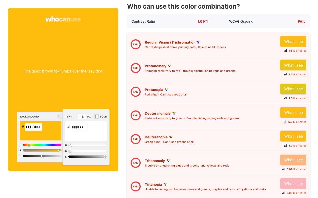
Ensure sufficient color contrast:
- Tools for checking color contrast, such as whocanuse, are particularly useful.
- Care should be taken to ensure that the contrast ratio between text and background complies with the WCAG guidelines (at least 4.5:1 for normal text and 3:1 for large text). This applies to websites and HubSpot landing pages as well as emails.
Consider and simulate different forms of color blindness
It is advisable to use simulation tools for color blindness (such as Coblis) to check how the website and HubSpot content look for users with different color vision disorders. This enables potential problems to be identified and rectified at an early stage.
Using patterns and textures in data visualizations
When creating reports and graphics in HubSpot, it makes sense to differentiate data series not only by color, but also by different patterns or line styles. Clear legends are essential here.
Clear labels and legends
It should be ensured that all visual elements, especially graphics and diagrams, are clearly labeled and have clear legends that are understandable even without color differentiation.
Focus on form and positioning
The use of shape and positioning to highlight important elements and create a clear visual hierarchy is recommended, rather than relying solely on color. Well-structured layouts and clear visual cues help all users to find their way around.
Test, test, test
Thorough testing of the designs is essential – ideally also with users who are affected by color blindness (if possible). Otherwise, comprehensive simulations and compliance with the WCAG guidelines will help.
Use accessibility as an opportunity for sustainable growth!
Considering colorblindness in web design is an important step towards a more inclusive and user-friendly digital presence. Designing websites, landing pages and emails in WordPress and HubSpot to be accessible to all not only improves the user experience, but also unlocks potential for sustainable growth. It is worth integrating these aspects into the design and implementation of digital strategies!
Tools and resources
Further information
- WCAG – Web Content Accessibility Guidelines
- Accessibility Act (BaFG – Austria)
- Accessibility Reinforcement Act (BFSG – Germany)
- How your colorblind and colorweak readers see your colors (Part 1) – Interesting facts about colorblindness
- What to consider when visualizing data for colorblind readers (Part 2) – Design tips for colorblindness
- What’s it like to be colorblind (Part 3) – Interviews with colorblind people who describe how they experience their environment
Tools and simulations
- Viz Palette – Test color palette in various application areas
- who can use – Test contrast ratio of background and font color
- Colorblind Web Page Filter – Testing an existing website
- Coblis – Color Blindness Simulator – Upload and test an image/design
What is color blindness?
Color blindness (actually color vision deficiency) describes a limited ability to distinguish colors, caused by missing or defective cones in the retina. A distinction is made between anomalies (e.g. protanomaly, deuteranomaly, tritanomaly), dichromasia (e.g. protanopia, deuteranopia, tritanopia) and achromasia (complete grayscale vision).
How common is color blindness?
Worldwide, around one in 12 men and one in 200 women are affected; in Europe, around 8% of men suffer from red/green weakness.
Why is inclusive web design not a nice-to-have?
Without alternatives to pure color, a significant proportion of users do not recognize important elements, leave the page and do not convert. Accessibility increases dwell time, interaction and conversions and signals compliance with WCAG standards.
What legal requirements apply in Austria and Germany?
From June 28, 2025, the Accessibility Act (BaFG) in Austria and the Accessibility Reinforcement Act (BFSG) in Germany will regulate digital accessibility in accordance with WCAG 2.1 AA and EN 301 549. Violations can result in fines of up to €80,000 (AT) and €100,000 (DE).
How do I test the color contrast effectively?
Contrast ratios should be ≥ 4.5 : 1 (text) or ≥ 3 : 1 (large text) according to WCAG. Tools such as Whocanuse check background/text ratios in real time.
Which simulation tools are recommended?
Coblis (color-blindness.com) or the Color Report on Viz Palette provide realistic previews for protanopia, deuteranopia, tritanopia and monochromatism.
What best practices ensure color-friendly design?
- Never use colors as the sole distinguishing feature; use icons, patterns or text labels as a supplement
- Highlight CTAs through shape, position and clear labeling
- Check color palettes for contrast and adjust
- Integrate simulations regularly into the design workflow